Time series analysis of gas price data
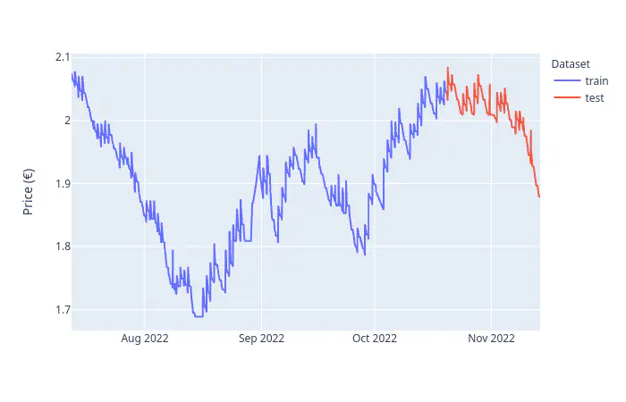
Table of Contents
- Introduction
- Theoretical Background
- Implementation
- References
Introduction
As part of the course Artificial Neural Networks 2 we had to do a project work regarding time series analysis, specifically using the SARIMA and SARIMAX model. The assignment covers the following points:
- Theoretical
- What is ARIMA?
- What is SARIMA?
- What is SARIMAX?
- What is the difference between ARIMA and SARIMA?
- Explain the hyperparameters for SARIMA.
- List some time series evaluation metrics.
- List some statistical tests for stationarity.
- Practical
- Define the time series evaluation functions.
- Implement a statistical test to check for stationarity.
- Model some time series data with SARIMA and SARIMAX.
- Visualize the results.
I recently started collecting Diesel prices from Austrian gas stations, so this presented a perfect opportunity to analyze the dataset. Before diving into the implementation, I’d like to go over the theoretical concepts required for this project.
The following libraries are required to run the code:
import warnings     # To supress warnings/errors
from tqdm import tqdm   # Progress bar

# Data handling/wrangling
import pandas as pd
import numpy as np
import itertools
from datetime import timedelta

# Time series
from statsmodels.tsa.statespace.sarimax import SARIMAX
from statsmodels.tsa.stattools import adfuller
from statsmodels.tsa.seasonal import seasonal_decompose
from statsmodels.tsa.stattools import acf, pacf

from pmdarima.model_selection import train_test_split
from sklearn import metrics

# Plotting
import matplotlib.pyplot as plt
from plotly.io import write_json
import plotly.express as px
import plotly.graph_objects as go
from plotly.subplots import make_subplots
Theoretical Background
Stationarity
The definition for stationarity is that the statistical laws governing the process do not change over time. Specifically, we differentiate between
- strictly (first-order) stationary, if the joint distribution of random variables is constant over time.
- weakly (second-order) stationary, if the mean is constant over time and the covariance function is time-indepentend.
The assumption of (weak) stationarity is required by many time series models.
ARIMA
A time series ${Y_t}$ is said to follow an integrated autoregressive moving average model if the $d$th difference $W_t = \nabla^d Y_t$ is a stationary ARMA process. If ${W_t}$ follows an $\mathit{ARMA}(p, q)$ model, we say that ${Y_t}$ is an $\mathit{ARIMA}(p, d, q)$ process.
(Cryer and Chan 2008)
Most cases are covered with $d=1$ or $d=2$, higher values are not recommended. The $\mathit{ARIMA}(p, 1, q)$ model has the following form:
$$ Y_t = \sum_{j=-m}^t W_j $$
where $W_t = Y_t - Y_{t-1}$,
$$ W_t = \phi_1 W_{t-1} + \phi_2 W_{t-2} + \cdots + \phi_p W_{t-p} + e_t - \theta_1 e_{t-1} - \theta_2 e_{t-2} - \cdots - \theta_q e_{t-q} $$
SARIMA
The following graph shows the co2 dataset available via R’s TSA package, which is a prime example for seasonal time-series data.
co2_df = pd.read_csv('./data/co2.csv')
fig = px.line(
    co2_df, y='x',
    title='Monthly Carbon Dioxide Levels at Alert, NWT, Canada',
    labels={'x': 'CO2', 'index': 'Index'})
fig.update_layout(xaxis_title=None)
fig.show()
To accommodate the seasonality illustrated in the above figure into the model, we add an additional $\mathit{AR}$ process of order $P$, and a $\mathit{MA}$ processes of order $Q$, each with a seasonal period of order $s$ to reflect the seasonality:
- $\mathit{AR}(P)$: $Y_t = \Phi_1 Y_{t-s} + \Phi_2 Y_{t-2s} + \cdots + \Phi_P Y_{t-Ps} + e_t$
- $\mathit{MA}(Q)$: $Y_t = e_t - \Theta_1 e_{t-1} - \Theta_2 e_{t-2} - \cdots - \Theta_Q e_{t-Qs}$
The models can be seen as special cases of the AR and MA process with orders $p=Ps$ and $q=Qs$, with the coefficients $\Theta, \Phi = 0$ except for the seasonal lags $s, 2s, 3s, \ldots, Ps$ and $s, 2s, 3s, \ldots, Qs$.
Difference between ARIMA and SARIMA
The SARIMA model is an extension of ARIMA, differing only in the additional seasonal $\mathit{AR}(P)$ and $\mathit{MA}(Q)$ processes with seasonal period $s$.
SARIMAX
The Seasonal AutoRegressive Integrated Moving Average with eXogenous regressors model (SARIMAX), where exogenous means that the model considers exogenous variables, making it a multivariate time series model. The mathematical formulation is given by
$$ y_t = \beta_t x_t + u_t $$ $$ \phi_p(L)\tilde\phi_P(L^s)\Delta^d\Delta_s^Du_t = A(t) + \theta_q(L)\tilde\theta_Q(L^s)\xi_t $$
where $\beta_t x_t$ handles the exogenous variables, and the hyperparameters are
- $p$ the AR process order,
- $d$ the integration order of the process,
- $q$ the MA process order,
- $s$ the periodicity,
- $P$ the seasonal AR process order,
- $D$ the seasonal integration order of the process,
- $Q$ the seasonal MA process order.
Model Evaluation
We want to find the optimal time series model, implying that model comparisons are necessary. Therefore, we will create a train-test split of the available data, train several models, and evaluate them on the withheld test data based on the mean absolute percentage error (MAPE). The pyramid-arima library is a wrapper around statsmodels and provides a set of helper functions for time-series modeling. (Korstanje 2021) lists several other model evaluation strategies.
Implementation
This project uses gas price data collected over 4 months (2022-07-12 to 2022-11-13) hourly from https://spritpreisrechner.at.
The following data has been collected for the Turmöl gas station located in Villach:
| Attribute | Datatype | Description |
|---|---|---|
timestamp | datetime | Timestamp when the observation was collected |
price | number | Price in EURO |
The dataset has missing price entries, caused by errors during the data collection process.
Loading & Preprocessing
df = pd.read_csv(
    "./data/data.csv",
    dtype={'price': np.double, 'timestamp': str},
    parse_dates=["timestamp"])
df.info()
<class 'pandas.core.frame.DataFrame'>
RangeIndex: 2986 entries, 0 to 2985
Data columns (total 2 columns):
 #   Column     Non-Null Count  Dtype
---  ------     --------------  -----
 0   timestamp  2986 non-null   datetime64[ns]
 1   price      2727 non-null   float64
dtypes: datetime64[ns](1), float64(1)
memory usage: 46.8 KB
df.head()
| timestamp | price | |
|---|---|---|
| 0 | 2022-07-12 13:00:00 | 2.074 |
| 1 | 2022-07-12 14:00:00 | 2.074 |
| 2 | 2022-07-12 15:00:00 | 2.072 |
| 3 | 2022-07-12 16:00:00 | 2.070 |
| 4 | 2022-07-12 17:00:00 | 2.070 |
fig = px.line(
    df,
    x='timestamp', y='price',
    title='Collected diesel prices from Turmöl in Villach.',
    labels={'timestamp': 'Timestamp', 'price': 'Price (€)'})
fig.update_layout(xaxis_title=None)
fig.show()
How much data is missing?
# Calculate missing values, and its percentage.
numMissing = df['price'].isna().sum()
pctMissing = numMissing/df.shape[0] * 100
pctMissingRounded = np.round(pctMissing, 2)
~10% of missing data is acceptable, and we can impute the gaps to provide a seamless time series.
Imputing missing data
A common technique to impute time series data is interpolation. Panda’s provides a built-in interpolation method which supports many interpolation techniques, for example:
timeslinearpolynomialpchipspline
Choose the best interpolation method based on visual fit and outlier sanity.
interp_time_df = pd.DataFrame({
    'timestamp': df['timestamp'].values,
    'price': df.set_index('timestamp').interpolate(method='time').values.flatten(),
    'method': np.repeat(['time'], df.shape[0]),
})
interp_slinear_df = pd.DataFrame({
    'timestamp': df['timestamp'].values,
    'price': df.set_index('timestamp').interpolate(method='slinear').values.flatten(),
    'method': np.repeat(['slinear'], df.shape[0]),
})
interp_polynomial_df = pd.DataFrame({
    'timestamp': df['timestamp'].values,
    'price': df.set_index('timestamp').interpolate(method='polynomial', order=2).values.flatten(),
    'method': np.repeat(['polynomial'], df.shape[0]),
})
interp_pchip_df = pd.DataFrame({
    'timestamp': df['timestamp'].values,
    'price': df.set_index('timestamp').interpolate(method='pchip').values.flatten(),
    'method': np.repeat(['PCHIP'], df.shape[0]),
})
interp_spline_df = pd.DataFrame({
    'timestamp': df['timestamp'].values,
    'price': df.set_index('timestamp').interpolate(method='spline', order=3).values.flatten(),
    'method': np.repeat(['spline'], df.shape[0]),
})

interp_methods_df = pd.concat([
    #interp_time_df,       # Exact result as with slinear method
    interp_slinear_df,
    interp_polynomial_df,
    interp_pchip_df,
    interp_spline_df
])
interp_methods_df.head()
| timestamp | price | method | |
|---|---|---|---|
| 0 | 2022-07-12 13:00:00 | 2.074 | slinear |
| 1 | 2022-07-12 14:00:00 | 2.074 | slinear |
| 2 | 2022-07-12 15:00:00 | 2.072 | slinear |
| 3 | 2022-07-12 16:00:00 | 2.070 | slinear |
| 4 | 2022-07-12 17:00:00 | 2.070 | slinear |
fig = px.line(
    interp_methods_df,
    x='timestamp',
    y='price',
    color='method',
    title='Comparison of interpolation methods.',
    labels={'timestamp': 'Timestamp', 'price': 'Price (€)', 'method': 'Method'})
fig.update_layout(xaxis_title=None)
fig.show()
Based on the graph above, the best-fitting interpolation method is slinear because:
- interpolated data fits well with regards to the surrounding observations,
- the original data has linear components (zoom in on the raw data).
We continue to investigate how well the interpolated data fits in with the rest. By combining the original data with the interpolations into a single plot we can better judge the overall plausibility of the time-series.
# Join interpolated and original data points to a single dataframe.
merged_orig_interp_df = interp_slinear_df \
    .drop('method', axis=1) \
    .merge(df, on='timestamp', how='inner', suffixes=('_interp', '_orig'))

# Mark imputed values.
merged_orig_interp_df['imputed'] = merged_orig_interp_df.apply(
    lambda x: x['price_orig'] != x['price_interp'],
    axis=1)

# Merge `price_interp` and `price_orig` to a single `price`.
# Note: Don't just take the interpolated price because it could deviate,
# depending on the interpolation method.
merged_orig_interp_df['price'] = merged_orig_interp_df.apply(
    lambda x: x['price_interp'] if x['imputed'] else x['price_orig'],
    axis=1)

# Remove irrelevant columns.
merged_orig_interp_df = merged_orig_interp_df.drop(['price_orig', 'price_interp'], axis=1)
fig = px.scatter(
    merged_orig_interp_df,
    x='timestamp', y='price',
    color='imputed',
    title='Imputed gas price time series.',
    labels={'timestamp': 'Timestamp', 'price': 'Price (€)', 'imputed': 'Imputed'})
fig.update_layout(xaxis_title=None)
fig.show()
Preparing a minimal working dataframe
The previous steps loaded and preprocessed the dataframe, resulting in unnecessary columns, too much data The next sections only work with this dataframe, nothing else should be required.
data_ts = merged_orig_interp_df.drop('imputed', axis=1) # Remove `imputed` indicator
data_ts = data_ts.set_index('timestamp') # set index to simplify plotting of dates, and back-matching of `imputed` values.
data_ts.info()
<class 'pandas.core.frame.DataFrame'>
DatetimeIndex: 2986 entries, 2022-07-12 13:00:00 to 2022-11-13 22:00:00
Data columns (total 1 columns):
 #   Column  Non-Null Count  Dtype
---  ------  --------------  -----
 0   price   2986 non-null   float64
dtypes: float64(1)
memory usage: 46.7 KB
data_ts.head()
| price | |
|---|---|
| timestamp | |
| 2022-07-12 13:00:00 | 2.074 |
| 2022-07-12 14:00:00 | 2.074 |
| 2022-07-12 15:00:00 | 2.072 |
| 2022-07-12 16:00:00 | 2.070 |
| 2022-07-12 17:00:00 | 2.070 |
Time Series Characteristics
fig = px.line(data_ts, title='Gas price time series', labels={'value': 'Price (€)', 'timestamp': 'Timestamp'})
fig.update_layout(showlegend=False, xaxis_title=None)
fig.show()
write_plotly(fig, 'assets/plotly-gas_price_time_series.json')
The above plot shows a discrete, univariate time series with equidistant measurements of gas prices of a gas station. The time series is non-stationary because of the global trend and seasonal patterns, namely
- daily seasonality: prices are generally decreasing in the afternoon (due to the Austrian law),
- weekly seasonality: prices are generally lower on sundays, and more expensive during the week (supply and demand).
Decompose the time series to get a general picture of its composition.
decompose_data = seasonal_decompose(data_ts, model='multiplicative')
fig = make_subplots(
    rows=4,
    shared_xaxes=True,
    subplot_titles=('Observed', 'Trend', 'Seasonal', 'Residuals'),
    vertical_spacing=0.05)
fig.add_trace(go.Scatter(x=data_ts.index, y=decompose_data.observed.values), row=1, col=1)
fig.add_trace(go.Scatter(x=data_ts.index, y=decompose_data.trend.values), row=2, col=1)
fig.add_trace(go.Scatter(x=data_ts.index, y=decompose_data.seasonal.values), row=3, col=1)
fig.add_trace(go.Scatter(x=data_ts.index, y=decompose_data.resid.values), row=4, col=1)
fig.update_layout(showlegend=False, height=800)
fig.show()
The observed data shows a global oscillating trend with autocorrelations even offsite the seasonal lags (Cryer and Chan 2008), therefore we choose a multiplicative model.
The above decomposition graph shows the components of the time series.
Investigation of the seasonal graph shows a daily trend peak at noon, and a low at around 8-9am.
Stationarity
Several methods are at our disposal to check for stationarity of a time series:
- Looking at the time series plot and judging by experience and knowledge.
- Plotting the sample autocorrelation function (ACF), which should die out quickly for stationary time-series.
- Applying the Augmented Dickey Fuller test.
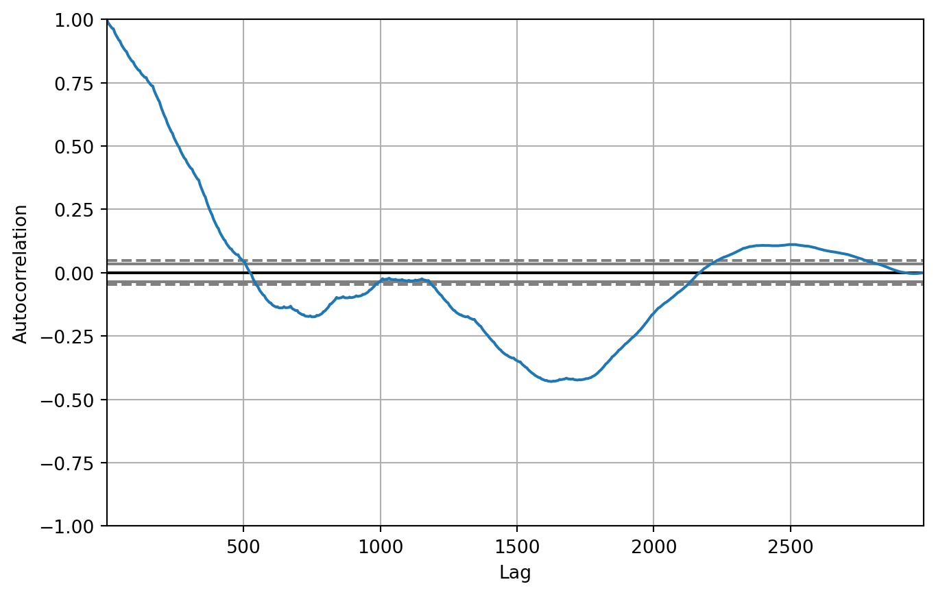
I already described the time series in the previous section, highlighting trends which indicate non-stationarity. Another method to estimate the process and seasonality order is to utilize the Autocorrelation and Partial Autocorrelation plots.
Define helper functions to plot the autocorrelation function (ACF) and partial autocorrelation function (PACF).
def plotACF(data: np.ndarray, nlags: int, title:str, alpha=0.05):
    acf_values = acf(x=data, nlags=nlags)
    fig = px.line(acf_values, labels={'value': 'ACF', 'index': 'Lag'})
    # Upper confidence level
    fig.add_shape(type='line', line_dash='dash', x0=0, x1=nlags, y0=alpha, y1=alpha, xref='x', yref='y', line=dict(color='gray'))
    # Lower confidence level
    fig.add_shape(type='line', line_dash='dash', x0=0, x1=nlags, y0=-alpha, y1=-alpha, xref='x', yref='y', line=dict(color='gray'))
    fig.update_layout(showlegend=False, title=f'Autocorrelation Function for {title}')
    return fig
def plotPACF(data: np.ndarray, nlags: int, title: str, alpha=0.05):
    pacf_values = pacf(x=data, nlags=nlags)

    fig = px.line(pacf_values, labels={'value': 'PACF', 'index': 'Lag'})
    # Upper confidence level
    fig.add_shape(type='line', line_dash='dash', x0=0, x1=nlags, y0=alpha, y1=alpha, xref='x', yref='y', line=dict(color='gray'))
    # Lower confidence level
    fig.add_shape(type='line', line_dash='dash', x0=0, x1=nlags, y0=-alpha, y1=-alpha, xref='x', yref='y', line=dict(color='gray'))
    fig.update_layout(showlegend=False, title=f'Partial Autocorrelation Function for {title}')
    return fig
ACF and PACF of the whole time series
Investigate the ACF and PACF plots of the whole time series data.
fig = plotACF(data_ts['price'].values, nlags=2800, title='Observations')
fig.show()
The sample ACF illustrated in the above plot does not completely die out and contains values significantly far away from 0.
fig = plotPACF(data_ts['price'].values, nlags=100, title='Observations')
fig.show()
This is a sign of the seasonality.
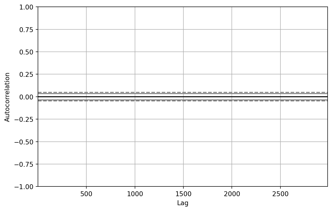
ACF and PACF of the seasonal components
Investigate the ACF and PACF plots of the seasonal component to get an idea of the approximate order of the seasonal processes.
fig = plotACF(decompose_data.seasonal, nlags=100, title='Seasonal Component')
fig.show()
The ACF shows a recurring pattern every 24 lags (24h), which is the approximate order of the seasonal MA process $\implies Q=24$.
fig = plotPACF(decompose_data.seasonal, nlags=100, title='Seasonal Component')
fig.show()
The PACF plot does not show any meaningful pattern, therefore we will try out $P=0,1$.
Statistical test for stationarity
The Augmented Dickey Fuller test gives a quantitative measure for the stationarity of a time series.
adf = adfuller(data_ts)

print(f'ADF statistic: {adf[0]}')
print(f'p-Value: {adf[1]}')
print(f'Number of lags used: {adf[2]}')
print(f'Number of observations used for ADF regression: {adf[3]}')
print(f'Critical values for the test statistic (alpha-levels):')
print(f'\t1%: {adf[4]["1%"]}')
print(f'\t5%: {adf[4]["5%"]}')
print(f'\t10%: {adf[4]["10%"]}')
ADF statistic: -2.042428521032194
p-Value: 0.2682849320027105
Number of lags used: 25
Number of observations used for ADF regression: 2960
Critical values for the test statistic (alpha-levels):
    1%: -3.4325611418959405
    5%: -2.8625169374916717
    10%: -2.5672900503332725
The above output shows a p-value above the significance level $\alpha=0.05$,
indicating non-stationarity.
To summarize, the time series is non-stationary. This is not a problem for the SARIMAX model because it contains a differencing part. Nethertheless, with a few lines of code we can make the time series stationary.
Establishing stationarity
data_ts_diff = data_ts.diff(periods=1)
fig = px.line(
    data_ts_diff,
    title='Once-differenced time series.',
    labels={'timestamp': 'Timestamp', 'value': 'Price difference (€)'})
fig.update_layout(showlegend=False, xaxis_title=None)
fig.show()
pd.plotting.autocorrelation_plot(data_ts)
plt.show()
pd.plotting.autocorrelation_plot(data_ts_diff)
plt.show()
The above plot shows that the 1x differenced time series is stationary.
Create a train-test split
We want to find the best models from a selection of hyperparameters via grid search. To ensure generalizability of the model we create a test set for evaluation.
test_size = int(data_ts.shape[0] * 0.2)
print(f'Test size: {test_size} (~20%)')

train, test = train_test_split(data_ts['price'], test_size=test_size)

train_test_df = pd.DataFrame({
    'price': np.concatenate((train.values, test.values), axis=0),
    'split': np.repeat(['train', 'test'], [train.shape[0], test.shape[0]])
})
train_test_df = train_test_df.set_index(data_ts.index)
Test size: 597 (~20%)
fig = px.line(train_test_df, y='price', color='split', labels={'price': 'Price (€)', 'split': 'Dataset'})
fig.update_layout(xaxis_title=None)
fig.show()
Find optimal hyperparameters for SARIMA
Define the search space of the hyperparameters. Due to limited time and computing resources we have a small search space with inadequate values. Please refer to the ACF and PACF plots above for better approximations.
params = {
    'p': [1, 2],    # AR order
    'd': [1],   # Differencing order
    'q': [1, 2],    # MA order
    'P': [0, 1],    # Seasonal AR order
    'D': [1],   # Seasonal differencing order
    'Q': [1, 2],    # Seasonal MA order
    's': [3],   # Seasonality period
}
Perform a grid search on the parameters to find the best model for predicting the future data.
model_scores = []   # Store the MAPEs for every model.
y_true = test.values

for pool in tqdm(itertools.product(*params.values())):
    p, d, q, P, D, Q, s = pool
    model = SARIMAX(
        endog=train.values,
        exog=None,
        order=(p, d, q),
        seasonal_order=(P, D, Q, s),
        enforce_stationarity=True,
        enforce_invertibility=True,
    )
    # Fit model to training data
    with warnings.catch_warnings(record=True):
        tsa_result = model.fit(full_output=False, disp=False)

    # Get predictions for testing data
    y_pred = tsa_result.forecast(test_size)
    model_scores.append({
        'params': pool,
        'score': metrics.mean_absolute_percentage_error(y_true, y_pred)
    })
0it [00:00, ?it/s]

1it [00:01,  1.18s/it]

2it [00:03,  1.67s/it]

3it [00:04,  1.62s/it]

4it [00:06,  1.76s/it]

5it [00:08,  1.65s/it]

6it [00:10,  1.89s/it]

7it [00:12,  1.93s/it]

8it [00:17,  2.94s/it]

9it [00:20,  2.82s/it]

10it [00:23,  2.88s/it]

11it [00:26,  2.89s/it]

12it [00:30,  3.26s/it]

13it [00:33,  3.21s/it]

14it [00:37,  3.44s/it]

15it [00:40,  3.38s/it]

16it [00:48,  4.67s/it]

16it [00:48,  3.01s/it]
scores = [x['score'] for x in model_scores]
fig = px.line(scores)
fig.update_layout(showlegend=False)
fig.show()
Find the smallest score from all the models.
min_score_idx = np.argmin(scores)
p, d, q, P, D, Q, s = model_scores[min_score_idx]['params']
print('The smallest score is produced with:')
print(f'\tp: {p}')
print(f'\td: {d}')
print(f'\tq: {q}')
print(f'\tP: {P}')
print(f'\tD: {D}')
print(f'\tQ: {Q}')
print(f'\ts: {s}')
The smallest score is produced with:
    p: 2
    d: 1
    q: 2
    P: 1
    D: 1
    Q: 2
    s: 3
Applying SARIMA
This section applies the tuned SARIMA model on the whole dataset to evaluate the forecasting performance.
tsa_sarima = SARIMAX(
    endog=data_ts['price'].values,
    exog=None,
    order=(p, d, q), # (p, d, q)
    seasonal_order=(P, D, Q, s) # (P, D, Q, s)
)
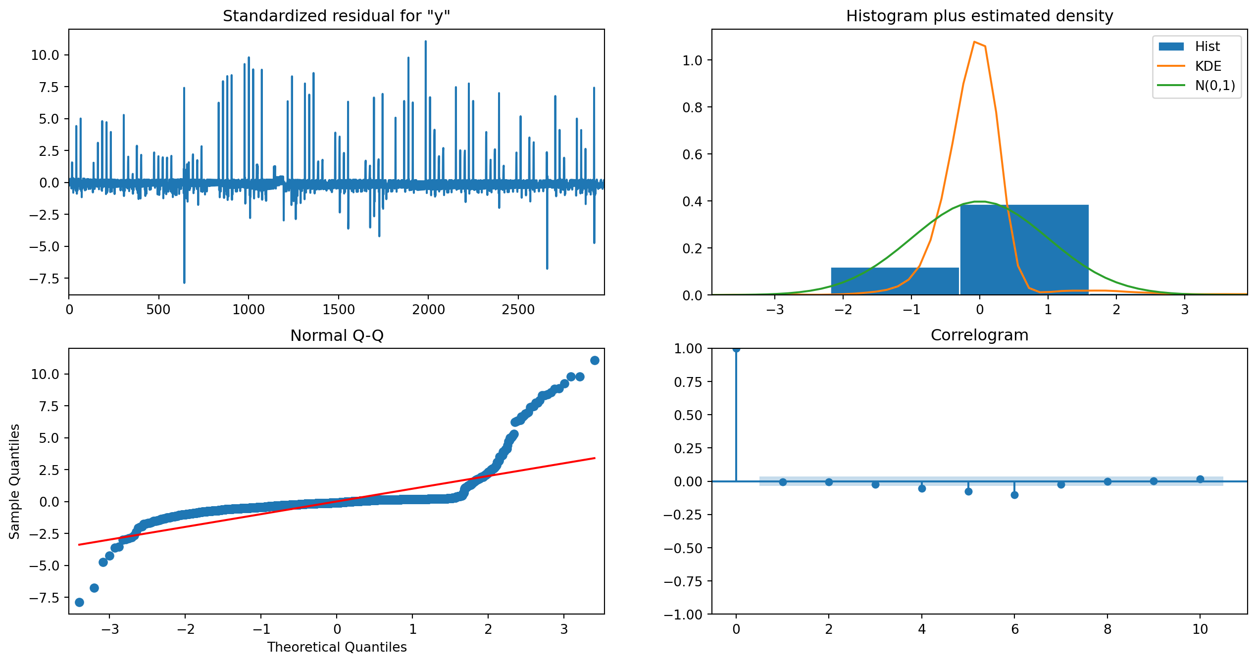
Fit the model and plot diagnostic information.
with warnings.catch_warnings(record=True):
    result_tsa = tsa_sarima.fit()

result_tsa.plot_diagnostics(figsize=(16, 8))
plt.show()
RUNNING THE L-BFGS-B CODE

           * * *

Machine precision = 2.220D-16
 N =            8     M =           10

At X0         0 variables are exactly at the bounds

At iterate    0    f= -3.39481D+00    |proj g|=  4.83603D+01

 This problem is unconstrained.


At iterate    5    f= -3.49247D+00    |proj g|=  9.14965D-02


At iterate   10    f= -3.49248D+00    |proj g|=  6.47695D-01


At iterate   15    f= -3.49319D+00    |proj g|=  7.25181D+00


At iterate   20    f= -3.49847D+00    |proj g|=  2.87762D-01


At iterate   25    f= -3.49887D+00    |proj g|=  3.28053D+00


At iterate   30    f= -3.51869D+00    |proj g|=  9.53561D+00


At iterate   35    f= -3.52442D+00    |proj g|=  9.21843D-01


At iterate   40    f= -3.52650D+00    |proj g|=  8.77803D+00


At iterate   45    f= -3.54427D+00    |proj g|=  1.46292D+00


At iterate   50    f= -3.54679D+00    |proj g|=  1.24297D+00

           * * *

Tit   = total number of iterations
Tnf   = total number of function evaluations
Tnint = total number of segments explored during Cauchy searches
Skip  = number of BFGS updates skipped
Nact  = number of active bounds at final generalized Cauchy point
Projg = norm of the final projected gradient
F     = final function value

           * * *

   N    Tit     Tnf  Tnint  Skip  Nact     Projg        F
    8     50     66      1     0     0   1.243D+00  -3.547D+00
  F =  -3.5467919390807574

STOP: TOTAL NO. of ITERATIONS REACHED LIMIT
Plot the time series model with in-order predictions.
pred_start = 5
pred = result_tsa.get_prediction(start=pred_start)

pred_x = data_ts.index[pred_start:]
upper_bound = pred.conf_int()[:, 0]
lower_bound = pred.conf_int()[:, 1]
fig = go.Figure([
    go.Scatter(
        x=data_ts.index,
        y=data_ts['price'].values,
        mode='lines',
        name='Observed'
    ),
    go.Scatter(
        x=pred_x,
        y=pred.predicted_mean,
        mode='lines',
        name='Predicted mean',
    ),
    go.Scatter( # Confidence bounds
        x=np.concatenate((pred_x, pred_x[::-1]), axis=0),
        y=np.concatenate((upper_bound, lower_bound[::-1]), axis=0),
        line=dict(color='rgba(255,255,255,0)'),
        fill='toself',
        fillcolor='rgba(0,0,0,0.2)',
        hoverinfo='skip',
        name='95% Confidence interval',
    ),
])

fig.update_xaxes(title_text='')
fig.update_yaxes(title_text='Price (€)')
fig.update_layout(showlegend=True, title='Modeling gas price data with SARIMA.')
fig.show()
Prediction
We want to forecast the next $7$ days of the gas price time series. The dataset has hourly data, meaning that we predict the next $24h * 7= 168$ datapoints.
forecast_steps = 24 * 7
fc = result_tsa.get_forecast(steps=forecast_steps)
Fill the data before the time series prediction with NaN values to align the predicted data with the observed data.
fill_empty_forecast = np.full(data_ts.shape[0], np.nan)

forecast_x = [data_ts.index.max() + timedelta(hours=t) for t in range(1, forecast_steps+1)]
fc_full_x = np.concatenate((data_ts.index, forecast_x), axis=0)
fc_full_y = np.concatenate((fill_empty_forecast, fc.predicted_mean),axis=0)

# Confidence bounds
fc_upper_bound_sarima = np.concatenate((fill_empty_forecast, fc.conf_int()[:, 0]), axis=0)
fc_lower_bound_sarima = np.concatenate((fill_empty_forecast, fc.conf_int()[:, 1]), axis=0)
Then plot the observed data, with the predicted mean and the confidence interval.
fig = go.Figure([
    go.Scatter(
        x=data_ts.index,
        y=data_ts['price'].values,
        mode='lines',
        name='Observed'
    ),
    go.Scatter(
        x=fc_full_x,
        y=fc_full_y,
        mode='lines',
        name='Forecast',
    ),
    go.Scatter( # Confidence bounds
        x=np.concatenate((fc_full_x, forecast_x[::-1]), axis=0),
        y=np.concatenate((fc_upper_bound_sarima, fc_lower_bound_sarima[::-1]), axis=0),
        line=dict(color='rgba(255,255,255,0)'),
        fill='toself',
        fillcolor='rgba(0,0,0,0.2)',
        hoverinfo='skip',
        name='95% Confidence interval',
    ),
])

fig.update_layout(
    showlegend=True,
    yaxis_title='Price (€)', xaxis_title=None,
    title='Forecasting gas prices with SARIMA model.')
fig.show()
The above figure illustrates the forecast of the next seven days alongside the $95%$ confidence bounds.
Applying SARIMAX
The exogenous parameter for the SARIMAX model will be a variable indicating whether the price was observed on a weekend (Saturday, Sunday).
Pyhon’s datetime has a built-in method weekday which returns the index of the weekday:
- $0$ corresponds to Monday
- $6$ corresponds to Sunday.
Create a variable which maps the weekdays to True/False to indicate workdays and weekends:
| Monday | Tuesday | Wednesday | Thursday | Friday | Saturday | Sunday |
|---|---|---|---|---|---|---|
True | False | False | False | False | True | True |
def mapDatetimeToPartOfWeek(t: pd.Timestamp):
    weekends = [0, 5, 6]
    return 0 if t.weekday() in weekends else 1

weekPartToNameMap = {
    0: 'Weekday',
    1: 'Weekend'
}

mappedWeekdays = [mapDatetimeToPartOfWeek(t) for t in data_ts.index]
Plot the distribution of the mapped data.
fig = px.histogram(
    [weekPartToNameMap[x] for x in mappedWeekdays],
    title='Histogram of weekends and weekdays.',
)
fig.update_layout(showlegend=False, xaxis_title=None)
fig.show()
Calculate the correlation between the variable indicating weekday/weekends and the gas price.
np.corrcoef(mappedWeekdays, data_ts['price'].values)
array([[1.        , 0.11049599],
       [0.11049599, 1.        ]])
The above output shows that the two variables have a correlation of around $11%$, enough to be considered as an exogenous variable.
tsa_sarimax = SARIMAX(
    endog=data_ts['price'].values,
    exog=mappedWeekdays,
    order=(p, d, q),        # (p, d, q)
    seasonal_order=(P, D, Q, s) # (P, D, Q, s)
)
Fit the model and plot diagnostic information.
with warnings.catch_warnings(record=True):
    result_tsa_sarimax = tsa_sarimax.fit()

result_tsa_sarimax.plot_diagnostics(figsize=(16, 8))
plt.show()
 This problem is unconstrained.

RUNNING THE L-BFGS-B CODE

           * * *

Machine precision = 2.220D-16
 N =            9     M =           10

At X0         0 variables are exactly at the bounds

At iterate    0    f= -3.39481D+00    |proj g|=  4.83590D+01


At iterate    5    f= -3.49247D+00    |proj g|=  6.62487D-02


At iterate   10    f= -3.49250D+00    |proj g|=  1.14803D+00


At iterate   15    f= -3.49567D+00    |proj g|=  1.71957D+00


At iterate   20    f= -3.49889D+00    |proj g|=  1.88079D-01


At iterate   25    f= -3.49985D+00    |proj g|=  6.76559D+00


At iterate   30    f= -3.51671D+00    |proj g|=  1.30153D+01


At iterate   35    f= -3.52756D+00    |proj g|=  1.26838D+00


At iterate   40    f= -3.52865D+00    |proj g|=  1.79911D+00


At iterate   45    f= -3.54423D+00    |proj g|=  2.97987D+00


At iterate   50    f= -3.54623D+00    |proj g|=  4.43845D-02

           * * *

Tit   = total number of iterations
Tnf   = total number of function evaluations
Tnint = total number of segments explored during Cauchy searches
Skip  = number of BFGS updates skipped
Nact  = number of active bounds at final generalized Cauchy point
Projg = norm of the final projected gradient
F     = final function value

           * * *

   N    Tit     Tnf  Tnint  Skip  Nact     Projg        F
    9     50     66      1     0     0   4.438D-02  -3.546D+00
  F =  -3.5462274967775929

STOP: TOTAL NO. of ITERATIONS REACHED LIMIT

Plot the model with in-order predictions.
pred_start = 5
pred = result_tsa_sarimax.get_prediction(start=pred_start)

pred_x = data_ts.index[pred_start:]
# Confidence bounds
upper_bound = pred.conf_int()[:, 0]
lower_bound = pred.conf_int()[:, 1]
fig = go.Figure([
    go.Scatter(
        x=data_ts.index,
        y=data_ts['price'].values,
        mode='lines',
        name='Observed'
    ),
    go.Scatter(
        x=pred_x,
        y=pred.predicted_mean,
        mode='lines',
        name='Predicted mean',
    ),
    go.Scatter( # Confidence bounds
        x=np.concatenate((pred_x, pred_x[::-1]), axis=0),
        y=np.concatenate((upper_bound, lower_bound[::-1]), axis=0),
        line=dict(color='rgba(255,255,255,0)'),
        fill='toself',
        fillcolor='rgba(0,0,0,0.2)',
        hoverinfo='skip',
        name='95% Confidence interval',
    ),
])

fig.update_xaxes(title_text='')
fig.update_yaxes(title_text='Price (€)')
fig.update_layout(showlegend=True, title='Modeling gas price data with SARIMAX.')
fig.show()
Prediction
Same as with the SARIMA model we want to forecast the next 7 days. The only difference is that we need the input from the exogenous variable; which we can simply deduce from the forecasting timestamps.
forecast_steps = 24 * 7

# Calculate timestamps which we want to forecast
forecast_x = [data_ts.index.max() + timedelta(hours=t) for t in range(1, forecast_steps+1)]
# Calculate exogenous variables
forecast_steps_exog = [mapDatetimeToPartOfWeek(t) for t in forecast_x]
# Get forecast
fc_sarimax = result_tsa_sarimax.get_forecast(steps=forecast_steps, exog=forecast_steps_exog)
fill_empty_forecast = np.full(data_ts.shape[0], np.nan)

fc_sarimax_full_x = np.concatenate((data_ts.index, forecast_x), axis=0)
fc_sarimax_full_y = np.concatenate((fill_empty_forecast, fc_sarimax.predicted_mean),axis=0)

# Confidence bounds
fc_upper_bound_sarimax = np.concatenate((fill_empty_forecast, fc_sarimax.conf_int()[:, 0]), axis=0)
fc_lower_bound_sarimax = np.concatenate((fill_empty_forecast, fc_sarimax.conf_int()[:, 1]), axis=0)
Plot the observed data with the predicted and mean and the confidence bounds.
fig = go.Figure([
    go.Scatter(
        x=data_ts.index,
        y=data_ts['price'].values,
        mode='lines',
        name='Observed'
    ),
    go.Scatter(
        x=fc_sarimax_full_x,
        y=fc_sarimax_full_y,
        mode='lines',
        name='Forecast',
    ),
    go.Scatter( # Confidence bounds
        x=np.concatenate((fc_sarimax_full_x, forecast_x[::-1]), axis=0),
        y=np.concatenate((fc_upper_bound_sarimax, fc_lower_bound_sarimax[::-1]), axis=0),
        line=dict(color='rgba(255,255,255,0)'),
        fill='toself',
        fillcolor='rgba(0,0,0,0.2)',
        hoverinfo='skip',
        name='95% Confidence interval',
    ),
])

fig.update_xaxes(title_text='')
fig.update_yaxes(title_text='Price (€)')
fig.update_layout(showlegend=True, title='Forecasting gas prices with SARIMAX model.')
fig.show()
SARIMA vs. SARIMAX
Compare the forecasting results of both time series models.
fig = go.Figure([
    go.Scatter( # Observations
        x=data_ts.index,
        y=data_ts['price'].values,
        mode='lines',
        name='Observed'
    ),
    go.Scatter( # Forecast SARIMA
        x=fc_full_x,
        y=fc_full_y,
        mode='lines',
        name='Forecast (SARIMA)',
    ),
    go.Scatter( # Forecast SARIMAX
        x=fc_sarimax_full_x,
        y=fc_sarimax_full_y,
        mode='lines',
        name='Forecast (SARIMAX)',
    ),
    go.Scatter( # Confidence bounds SARIMA
        x=np.concatenate((fc_full_x, forecast_x[::-1]), axis=0),
        y=np.concatenate((fc_upper_bound_sarima, fc_lower_bound_sarima[::-1]), axis=0),
        line=dict(color='rgba(255,255,255,0)'),
        fill='toself',
        fillcolor='rgba(0,0,0,0.2)',
        hoverinfo='skip',
        name='95% Confidence interval (SARIMA)',
    ),
    go.Scatter( # Confidence bounds SARIMAX
        x=np.concatenate((fc_full_x, forecast_x[::-1]), axis=0),
        y=np.concatenate((fc_upper_bound_sarimax, fc_lower_bound_sarimax[::-1]), axis=0),
        line=dict(color='rgba(255,255,255,0)'),
        fill='toself',
        fillcolor='rgba(0,0,0,0.2)',
        hoverinfo='skip',
        name='95% Confidence interval (SARIMAX)',
    ),
])

fig.update_layout(
    showlegend=True,
    yaxis_title='Price (€)', xaxis_title=None,
    title='Forecasting gas prices, SARIMA vs. SARIMAX.')
fig.show()
The above figure shows that there is only a slight difference between the SARIMA and SARIMAX model. Utilizing some other exogenous variable with better information we probably would have ended up with very different results.
References
Cryer, Jonathan D., and Kung-sik Chan. 2008. Time Series Analysis: With Applications in r. 2nd ed. Springer Texts in Statistics. New York: Springer.
Korstanje, Joos. 2021. Advanced Forecasting with Python: With State-of-the-Art-Models Including LSTMs, Facebook’s Prophet, and Amazon’s DeepAR. Berkeley, CA: Apress. https://doi.org/10.1007/978-1-4842-7150-6.
Peter W. Egger
Software Engineer / Data Scientist
Maker culture enthusiast and aspiring data scientist.